Posted on February 12, 2013 at 12:00 pm
January 25, 2013 No Comments
Here’s a scenario for you: a woman has three young children, each armed with a handful of crayons. They’re happily drawing on a large sheet of paper, cooperating and sharing colors. The woman leaves the room for a moment, and when she comes back, she is dismayed to find that the children have all begun scribbling on the walls. There are squiggly lines of color everywhere, ruining her pristine, white paint job. Imagine you are this woman. What do you do next Do you praise the children’s artistic contribution to the decor Or do you grab the nearest sponge and start scrubbing frantically before the company comes over
If you’re like most moms, the answer is obviously the latter, but why Is it because you want to tyrannize the kids Infringe on their self-expression Probably not. More likely, you just want to maintain a sense of order in the house. Three toddlers running amok with crayons would quickly become chaotic. And in a world of chaos, no one is happy; neither you nor the children, even though they were the ones who started the madness.
Defending Design Simplicity
Antoine de Saint-Exupery once said that “perfection is achieved, not when there is nothing more to add, but when there is nothing left to take away.” That’s a nice quote, but what does it mean in the practical sense Sure, it’s telling us that simple is better than complicated. Most of us know that instinctually. No one wants a pen that’s also a steam iron, a soap dispenser, and a toaster oven. But how do we avoid ending up with one Here’s a secret: it doesn’t just happen. Most people have an idea of the perfect simple, elegant solution to their design problem. The downside is, so does everyone else who has the same problem. Put them all in a room together, and you’ll have not consensus, but pandemonium. Everyone will contradict each other, and sometimes even themselves, in pursuit of the “ultimate” solution that will be universally beneficial. In one of the greatest paradoxes of human nature, when everyone has a say in what they think will make everyone happy, the result – invariably – is that no one is happy.

The underlying imperative of de Saint-Exupery’s words is that there must be someone in charge of a process who makes the single, final decision. There must be one person – or a small, unified group of persons – who will ruthlessly prune the savage garden of the horde, creating a result that is not what anyone said they wanted, but what is truly needed. They must be able to think globally, rather than provincially. They must be willing and able to ignore what people say, and focus on what is objectively best. They must lead and they must be vigilant about it. Any slack during this crucial moment, the final verdict, will unravel the entire operation, resulting in a quagmire of confusion that will suck everyone under.
In other words, they have to act like moms.
Don’t Make a Mess
People like to believe they’re an important part of a decision making process. And they are – just not quite in the way they think. A consumer’s role in a design process is both less and more important than it often appears. It’s less important because what people tell you they want is almost always irrelevant. That might sound harsh, but it’s actually a good thing. Recall the earlier example of the multi-purpose pen. Everyone you question will tell you something slightly different about what they “really” want in a pen. Some people will want a pen that can light up. Others will want a pen that does arithmetic. Still others will want one that can write underwater, or that is made out of living plant fibers, or that will give off a heavenly aroma of freshly baked cookies. If you’re a reasonable sort, you’ll want to take everyone’s ideas equally seriously. It’s only fair – the customer is always right.
 Image Source: Colorful Foreground Silhouette via Shutterstock.
Plus, you might think all those ideas sound equally as cool – who wouldn’t want a pen that can do all of those things In magical unicorn land, it would be perfect, a must-have item. But here’s the thing about the real world: when you add features, you get mass, and mass equals mess. Let me repeat that: features = mass = mess. And a mess is completely at odds with de Saint-Exupery’s words of wisdom above. Nobody likes a mess. That perfect pen dreamed up by your well-meaning consumer test group would be the size of a wine bottle and weigh as much as a brick. Sure, it would have all the features everyone asked for, but who do you think is actually going to use it What people say is irrelevant. As a designer, you must be prepared, like a good, caring mom, to give them what they need.
A consumer’s big, important role to play in a design process – their time to shine – is in demonstrating what they really, truly need in a product. Contrary to the things people say, what they need is extremely important. It is only through solving a need that any designer can hope to have a career. But how do you tell the difference If you can’t trust people to tell you what they need (and you can’t), how can you possibly figure it out Should you guess Do you simply create things arbitrarily, assuming you instinctually know what everyone’s needs are Of course not. That’s just as careless as adding too much mass. Do you embrace your inner creep and watch them intently, observing their habits and formulating an ideal solution based on what you see
Well… yes.
Conclusion
People love to tell you how iconoclastic they are. Everyone else is one way, but they are different because (fill in the blank). The truth is, the majority of human beings on this planet are remarkably similar in behavior, even people who might superficially be categorized as “different.” True deviations from the norm are often frightening – sociopaths and murderers – or patently obvious mental or personality disorders. The rest of us – natives and immigrants, extroverts and introverts, liberals and conservatives, Mac users and Windows users and DIY Linux geeks – we’re all more alike than we typically care to admit. And when we come together to form a market for a product, our actions as a unit usually prove it. We demonstrate what we really want, what we need, by how we behave; what we buy, when we buy it, how we pay for it, or even if we pay for it. (How much “shoplifting” would there be if people had to pay for air) This is the meat of good design; the thing that makes it revolutionary. You must indulge your inner creep, or your inner mom, and let your market speak to you not with what they say, but with what they do.
What Do You Think
Got any horror stories about design-by-committee What am I saying – you’re designers: of course you do. Don’t be shy – let us know about all the times you’ve had to step in and be the “designer mom” for your clients.
You may also like…
The Art of Going Freelance
Posted in Web Design
Posted on February 12, 2013 at 11:57 am
Themify has come a long way since its launch 3 years ago, and I thought it was finally time to redesign the Themify website. The goal of Themify is to make it easy for anyone to build a beautiful, responsive website using WordPress and Themify themes. This means that we need to stay ahead of web design trends, and I thought that the redesign should reflect our desire to incorporate the latest and greatest practices found in the design world right into our website. This post will take you behind the scenes around our planning and decision making process, as well as some of the work that didn’t make the final cut for the Themify website.
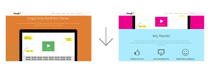
First Version of the Redesign
The redesign process started about a year ago, and below is the first version of the redesign. I tried to update the style from the existing designs, but after a few mockups, the project had to be put on hold due to the overwhelming work load at Themify.

Second Version: Flat & Colorful
After several months, I decided that the redesign should take priority and pushed for completion. I felt the first version was not really what I envisioned for Themify, so I scrapped the idea and started toying around with the idea of a flat design style.
Flat design was completely new to me, as I was so used to illustrative design, working with a very high level of detail.

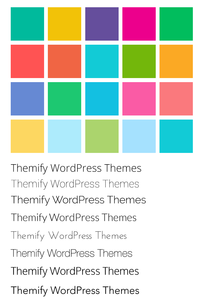
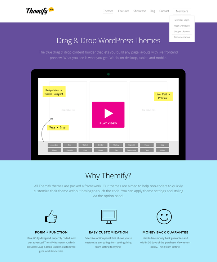
I started the mood board by collecting the fonts and colors that were suitable for flat design. Below is the home mockup of the second version.

Abandoned Splash Animation
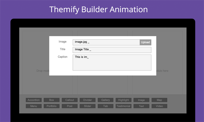
Intially, I wanted to show an animation, made entirely in CSS3 and Javascript, to advertise the functionality of the Drag & Drop Builder on the homepage, but I decided that the animation generated too much unnecessary overhead with respect to markup. Below link is a prototype of that animation.

Final Touches
After completing the static design, I added transition effects to spice up the presentation of our beautiful imagery, emphasize the marketing copy, and really catch the user’s attention.
Shrinking Fixed Header
The header is a great way for our users to quickly navigate around the Themify website, but I didn’t want it taking up so much screen real estate. The end result was creating a fixed announcement and menu bar that shrink smoothly as you scroll down.

Parallax Scrolling
The nifty parallax scrolling section at the top was accomplished using CSS3 transform.

Fade-in and Fly-in Animation
As you scroll down the Themify homepage, images and text fade-in or fly-in to the content area. This animation was made completely reusable by simply entering its class name. (For example: .fly-in, or .slide-up, etc)

Color Morphing Background
With Flat design, color plays a vital role in the look and feel of the overall design, so I thought it would be a nice touch to create a color morphing background by animating a set of pre-set colors from one to the other. The end result turned out to be very nice, and I have received quite a bit of positive feedback for it.

Posted in Web Design
Posted on February 10, 2013 at 12:00 pm
Our Weekly Design Inspiration has been sponsored by DesignShock. Check them out for free weekly design bundles, including logo templates, icons, characters, WordPress themes, HTML & CSS templates, GUI sets and much, much more.


You may also like…
Comments and Reactions
Posted in Web Design
Posted on February 10, 2013 at 11:57 am
WordPress is one of the most ubiquitous content management systems in the world. Even better, it’s open source! However, as an open source piece of software, it can be vulnerable to malicious individuals digging through code and finding vulnerabilities in the code, which they attempt to exploit. As such, WordPress sites have been prone to security breaches and being hacked, and having your WordPress site hacked can be damaging to your reputation and your business. Fortunately, WordPress is already quite secure, so here are the best practices for improving the protection of your WordPress site.
Stay Updated
WordPress itself constantly badgers you about new updates that are available for WordPress – don’t ignore these! It’s vital that you stay up to date on your WordPress installs, themes, and plugins to ensure that any existing vulnerabilities have been patched up.
WordPress will display the update notifications as soon as you login, Themify shows you notifications on the Themify admin panel, and other plugins and themes should have something similar. Keep updating your files and stay up to date!
Remove Inactive / Old Themes and Plugins
Themes and plugins that are installed on your WordPress website, but are currently inactive or old versions are security risks: they may not be the most up to date and have security holes that malicious attacks can take advantage of.
Your best bet is to remove any themes and plugins that you are not currently using and stick with what you need.
Disable the Theme / Plugin Editor
Intruders who are able to guess your admin login and password are able to access your theme or plugin files and insert their own malicious code. For example, they can replace a template file into a PHP uploader and upload more files or change file permissions without your knowledge.
Disabling the built-in Theme and Plugin text editor inside of WordPress ensures that these intruders aren’t able to modify your Theme or Plugin code in any way.
In the directory that you’ve installed WordPress into, you will find a file called wp-config.php, and you will need to add the following code into that file:
/* disable theme editor and plugin editor */
define( 'DISALLOW_FILE_EDIT', true );
define( 'DISALLOW_FILE_MODS', true );
Once disabled, you should no longer be able to edit files inside of the WordPress admin panel.
Protect Your .htaccess File
Your .htaccess file acts like the gatekeeper for your website’s figurative guts. It allows you to control permissions of files, meaning you can determine who has access to specific files or file types. It’s a hidden file that sits in the root directory of your website, and you’ll need to show hidden files in order to be able to access it.
Once you are able to edit it, add this to the file:
# protect .htaccess file
<Files ~ "^.*\.([Hh][Tt][Aa])">
order allow,deny
deny from all
satisfy all
</Files>
This will ensure that no one from the outside world can access your .htaccess file, protecting yourself from intruders who attempt to change file permissions on your website.
Disable Directory Listing
While you’re inside of .htaccess, you might as well disable the ability to get directory listings from your WordPress install.
Directory listings are used to see all of the contents of folders, and are often used to look at websites as a whole. However, being able to see them is not good, as it usually means it’s exposed to the public, meaning that people can search for vulnerable files and exploit security holes.
You must be editing the root .htaccess (the one for your entire website install) of your website, and you need to add this:
Options -Indexes
This will restrict the ability for anyone and everyone from being able to list the contents of your website, making it that much harder to find vulnerable files.
Protect the ‘wp-config.php’ File
Another fun thing to add to your .htaccess file, since you’ve been inside of it for the previous two!
Your wp-config.php file contains a lot of information that can be very sensitive, should someone ever gain access to it. Things like your database username and password, which is essentially your WordPress website’s lifeline.
The WordPress website database can be protected by ensuring the wp-config.php file is locked down and secured. Add this to your .htaccess file:
# protect wp-config.php
<files wp-config.php>
order allow,deny
deny from all
</files>
As with everything else, this code prevents outside, public access for wp-config.php, ensuring that your very sensitive data is relatively secure!
Prevent ‘wp-login.php’ From Being Accessed by Unknown IPs
If you haven’t guessed yet, this is another fun trick done by editing the .htaccess file. The file, wp-login.php, is the gatekeeper to your WordPress admin panel. By default, you can access this page from anywhere and everywhere, which is convenient, but also a huge security risk.
Using .htaccess, a list of IPs can be created that are allowed access, commonly referred to as a ‘whitelist,’ to prevent non-known IPs from attempting password guesses.
Inside the root folder’s .htaccess, add this code:
<files wp-login.php>
order deny,allow
deny from all
# static IP
allow from xxx.xxx.xxx.xxx
# dynamic IP
allow from xxx.xxx.xxx.0/8
allow from xxx.xxx.0.0/8
</files>
Fill in your actual IPs in place of the x-placeholders. If you know your actual IP, stick with static (just be sure to update it, should it change!) or use dynamic if you need to allow a range of IPs. There are a multitude of websites that will give you your exact IP address, and they are a quick search away.
Prevent ‘wp-admin’ From Being Accessed by Unknown IPs
The protection levels of ‘wp-login.php’ through an IP whitelist can be doubled by creating the same whitelist for the wp-admin folder inside of the WordPress directory. Add this code to your .htaccess file to prevent non-known IPs from accessing your wp-admin folder:
<LIMIT GET>
order deny,allow
deny from all
# static IP
allow from xxx.xxx.xxx.xxx
# dynamic IP
allow from xxx.xxx.xxx.0/8
allow from xxx.xxx.0.0/8
</LIMIT>
Deny Executable Files Like .exe Extension
Executable files are trouble – they will often contain malicious code that can install worms and virus on user’s computer. These can be blocked, of course, using .htaccess!
Add this to your .htaccess file:
# deny all .exe files
<files "*.exe">>
order deny,allow
deny from all
</files>
This, like the other code, prevents any and all .exe files from being access on the server, ensuring that you steer well away from those troublesome executables.
Add a Firewall
Much like the .htaccess whitelist, allowing only known IPs access to wp-login.php, a firewall will only allow known IPs to access your FTP server. This is something that you will have to contact your website hosting provider to set up.
Additional Plugin Recommendations
Acunetix WP Security
Login LockDown
AskApache Password Protect
Conclusion
Website security is typically the last thing on the minds of website owners, but priorities should be raised on website security to keep WordPress sites safe and secure. The above list is a solid start, and hopefully useful.
References
Posted in Web Design
Posted on February 8, 2013 at 12:00 pm

In this roundup, we bring to you a collection of 40 Photoshop scribble and doodle brushes. Design projects and client work apart, even if you are not into scribbling and doodle art, you should still check these brushes out: creativity is useless without fun, and what better way to have fun than trying out some doodle brushes So without wasting anymore time, here are the brushes: You may also like:…

Posted in Web Design
Posted on February 8, 2013 at 11:57 am
I apologize for not posting on the Wall for the longest time, but yes, I’m still alive (just been busy with Themify). Today I have an awesome post to share — 30 great interactive sites. HTML5, CSS3, and Javascript have opened up many design possibilities. Web design nowadays is very interactive, it is no longer limited by static layouts. The 30 sites listed below demonstrate great examples of interactive web design. It ranges from simple transition effect to cool parallax scrolling to rich media presentation such as music audio and videos. Enjoy!
Bienville Capital Management
The Bienville Capital Management site offers seamless transition between pages. Try to click around the site and you will notice there is no redirection when navigating to different pages. The page transits smoothly with fading and sliding animation.

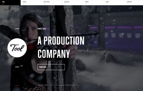
Tool of North America
At the first glance, the Tool of North America site looks like a Flash site, but it is actually all done with Javascript, HTML5 and CSS3. The animation is super slick. The only downside is the content is not indexable by search engines because it is pulled with Ajax (not SEO friendly at all). If you disable Javascript, you will get a blank page. Despite the SEO and accessibilty issue, the interaction is amazing. Don’t forget to check out the site on mobile; it is also nicely done.

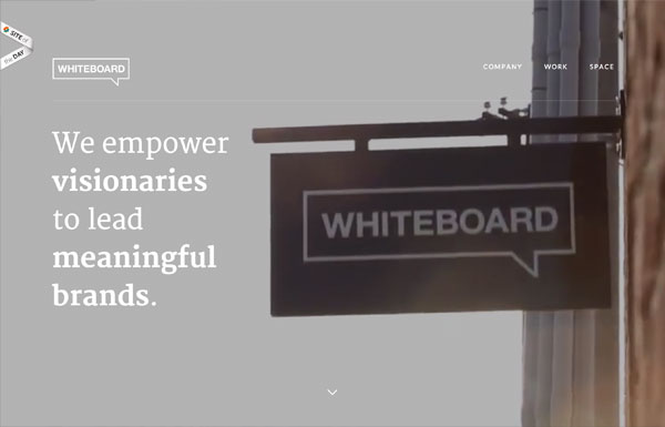
Whiteboard
The background’s blurry effect is particularly stunning on the Whiteboard site. To see it yourself: narrow your browser to mobile breakpoint or check it on a mobile device and click on the menu icon, the background will be transformed with the blur effect.

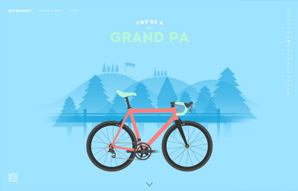
Cyclemon
Simply beautiful illustrations presented with parallax scrolling!

Mahedine Yahia
The main background animation on Mahedine’s site consists of 191 images (each image is about 56kb file size, 470 x 264px). It produces frame-by-frame animation effect as you scroll.

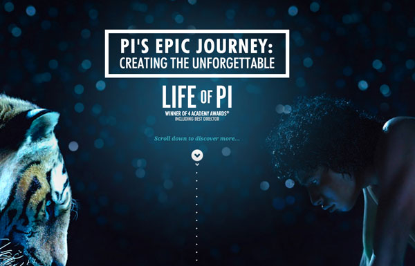
Life of Pi
The Life of Pi jorney site has taken parallax scrolling and frame-by-frame animation to another level. If you like the movie, you will definitely enjoy scrolling on their site. It shows you behind the scene materials in frame-by-frame animation as you scroll. The result is breath-taking with just over 100 images with heavy Javascript and CSS3 work.

Teehan+Lax
Each story (post) on Teehan+Lax is beautifully crafted with great attention to details. The content is presented with beautiful typesetting and subtle animation effects (eg. check these two posts). In case you are not aware of this minor UX detail: when you are at the middle of the page, notice the top nav bar slides down when you scroll up and it slides up again when you scroll down. The logic makes perfect sense. When you scroll down, you probably want to continue to read, so you don’t want the nav bar to obstruct your reading area. When you scroll up, the nav bar appears in case you want to jump to another page.

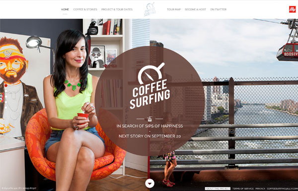
Coffee Surfing illy
The page transition on Coffee Surfing illy site is not as seamless as the Bienville Capital Management site as mentioned above, but the half page scrolling is interesting. When you scroll, the page is divided in half and scroll in opposite direction.

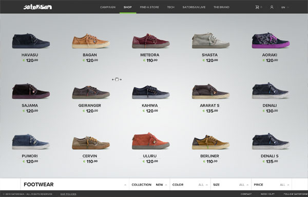
Satorisan
Satorisan has a very nice shop design. The shop main page allows you to view all products in a scrollable/draggable horizontal list. Clicking on any product will transit to the product detail page with parallax scrolling effect.

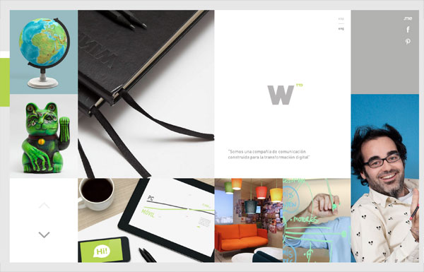
Wink TTD
Wink did an awesome job on their responsive and interactive website. Whether you are viewing the site on a large iMac screen or a tiny iPhone display, the design and animation is very consistent.

Solasie
From design to interaction, the Solasie site is two thumbs up. It was pleasant browsing on the site to enjoy the rich media content (gallery images, music, and videos). The only problem is the SEO and accessibilty issue. The content is not indexable and the page URLs can not be shared because the pages are queried with Ajax. This is a common problem with sites relying on Ajax to display the content, but they often provide anchor tags in the URL bar for sharing pages.
 0
0
REI 1440 Project
The timeline presentation on the REI 1440 site is very suitable for their concept, “minute-by-minute” timeline making up a 24-hour period. You can use the arrow keys to navigate through the timeline which saves time from moving your mouse and clicking. Try out their clock time selector — from design concept to technical execution, all were done excellently!
 1
1
Sketchin
The text masking on the navigation menu is a nice touch to the site.
 2
2
Anonymous
Anonymous agency not only makes good design, but they present their portfolio well. The portfolio images were masked with silhouette of faces — very cute! The portfolio expander might seem like it is pulled with Ajax, but they are actually separate pages. Also, notice the tiny detail of the year bubble tooltip as you scroll through the portfolio items?
 3
3
Beatbox Academy
The Beatbox Academy lets you create drum beats by hitting certain keys on your keyboard. It doen’t really serve any other purposes (you can not save or export the beats), but it is fun. The parallax scrolling on the site is nicely done though.
 4
4
Quartz
Quartz puts the center focus on the content. Unlike most news/editorial sites where they force you to click on the article to read full story, Quartz displays all articles with full content on one page. As you scroll through the articles, the address bar automatically updates the URL (good for sharing articles). Their mobile breakpoint provides the same browsing experience as on the desktop.
 5
5
Evans Halshaw – Bond Cars
If you are a parallax scrolling lover, this Bond Cars site by Evens Halshaw is a must see.
 6
6
Zurb Manifesto
Another parallax scrolling site.
 7
7
Peugeot Hybrid4
If you think the above parallax scrolling sites are cool, wait until you see the Peugeot Hybrid4 site below — nice illustrations, keyframe animation, awesome sound effects, and great transition. Don’t forget to turn on your speakers while checking the site.
 8
8
Chrysler: Test of Ownership
Chrysler’s Test of Ownership site is another good example of page transition. The page layout/content transits nicely when switching different pages. Not to mention the beautiful animation on the Proof page. Scrolling down will animate the numbers, charts, and bars. Scrolling up will reverse the animation. Simple, but cool.
 9
9
Tinke
As you scroll on the Tinke site, it shows you a complete walk-through of the product, all in action! Unfortunately, it is not responsive.
 0
0
Milwaukee Police News
Have you seen a police site this cool with Ajax and parallax scrolling?
 1
1
2am Media
Although the tree branch styled menu on the 2am Media site reminds of the old school Flash sites, but it is incredible with Javascript!
 2
2
Minimal Monkey
Minimal Monkey is a simple site by Stephen Burgess which offers great user experience. The layout, page transition, and navigation are very well thought-out on all responsive breakpoints.
 3
3
Athenos
Athenos is a lovely site with a lot of design details and transition effects. It has also proven that modern sites are heavy on page load. Just this animated GIF file on the site is 2.5mb. Beauty does come with file size!
 4
4
Meng To
Meng To presents his works nicely with big bold images and fly-in animation.
 5
5
RED
The RED agency site is full of design details and animation effects. Be sure to click around the site.
 6
6
Carbon Studio
If you miss the old-school Flash sites with drag and drop navigation, check out the Carbon Studio site.
 7
7
Oakley Airbrake MX
The Oakley Airbrake MX site is another crazy example of parallax scrolling. The product tour is visually stunning!
 8
8
Nick Jones
Nick Jones’s site might be outdated, but the interaction design is still very good.
 9
9
More…
Most of these sites are found on Best Web Gallery. Thanks to Chad Mueller for managing and collecting inspirational sites on Best Web Gallery. Check out Best Web Gallery for more sites.
Posted in Web Design
Posted on February 6, 2013 at 11:57 am
This tutorial will show you how to create an interactive map of the world you can use to display travel photos. In the process, you’ll be introduced to Raphael.js. It is a small JavaScript library that makes it easy to work with vector graphics. Instead of using HTML5 Canvas for interactive animations, it uses SVG […]

Posted in Web Design
Posted on February 4, 2013 at 12:00 pm
January 21, 2013 No Comments
One of the more convoluted yet rewarding opportunities of as a freelancer is the freedom in your own schedule. This is especially true when working online, since most digital products may be created at any point from any computer. This means freelance writers, designers, and developers are constantly working towards a better means of communication.

At times this can lead to 3rd party solutions or even creating your own software out of desperation. But ultimately the largest goal should be security in your own accounts, and with your clients. In this article I want to discuss a few ideas on security which are geared towards freelancers. Although the Internet has become a much safer place over the years, there are still a lot of pitfalls to worry about.
Changing your Account Passwords
This can be a real challenge for some people who basically cannot stand major changes. I too often have a difficult time remembering to update my passwords every so often. But this is the greatest defense against nosy snooping eyes looking to gain access into your e-mail or social networks.
I think some of the bigger websites stand out as a larger target, such as Google or Apple. Both of these tech companies provide many services which all tie into a single account. Having any big-name account compromised means that a hacker/cracker may gain access to a number of vital services under your name.

There are some other lesser-important websites which you may still consider updating the passwords 2-3 times a year. I feel that creating new passwords is such an annoying task, and the memorization makes it that much worse. I recommend purchasing a few pads of sticky notes and use these to write down new passwords. Keep them around your desk for 1-2 weeks until you can memorize the new passcodes.
Handling Money in Private
The idea of mobile security doesn’t always stand out to me, and it feels like a lie in many ways. When out on your mobile smartphone or tablet it is common to access Internet via 3G/4G or through somebody else’s open wi-fi connection. This may provide enough to browse Facebook or Twitter, but I would advise against placing invoices or payments on your device.
These mobile hotspots are the perfect target for people looking to pick up on user passwords. And having somebody gain access to your online banking account is possibly much worse than somebody getting into your Facebook or Google. As a general rule of thumb I say avoid dealing with payments online whenever away from the house or office. Your home network will be that much more secure and trusted, so it is worth the wait.
Regular Data Backups
I cannot stress how important it is to manage copies of your data. This may include documents for invoices, spreadsheets, written articles, digital contacts, along with other important documentation. But your backups may also contain copies of your most important projects for past & current clients.

Think of putting together copies from your favorite websites, graphics, backend development, or even blog posts. There are so many various types of data any freelancer may be working with on a monthly basis. But the larger point is that hard drives do fail over time. These events are often slow yet insidious unless you are monitoring your HDDs regularly using SMART testing.
But even if you are checking the health of your drives, this doesn’t stop one from failing. There is no prevention from drives burning out aside from moving your data off and replacing them quickly. By making data backups a regular part of your routine, this becomes second nature in the event any of your hard drives actually fails. This would hopefully result in no permanent data loss and could be cleaned up fairly quickly.
Managing Timelines
In the past we have written about productivity tips for freelancers with some very positive reception. Many of these tips still apply today, and can also affect your general security. Getting work done on time means you will not be rushing through the workload. This also means you will have a clearer mind to be focusing on whatever tasks are at hand.

It is important for any freelancer to manage various projects at once without difficulty. I don’t recommend biting off more than you can chew, as this ultimately leads to unnecessary stress. But it is possible to be working with more than 2 people at a time. This will require a great deal of motivation along with a to-do list full of tasks you can actually follow. But in a lot of ways this can build a secure work environment through the communication alone.
You want to trust the clients you’re working with and communication is key. This level-headed communication may be meeting in person, chatting on the phone, or connecting through IM chat. These methods are all perfectly viable if you are cautious and aware of who is paying attention. Privacy is not always considered to be so important, but this is quite the understatement.
Updating Important Software
I would argue that none of your work can be fully secured unless you know there are no vulnerabilities in your work station. Now this doesn’t mean you need to be using the latest release of Windows or OSX. In fact I would argue against this since new releases are often riddled with bugs. However you should confirm that your current operating system is fully patched and running the latest release version, whatever that may be.
It is all too easy for some backdoor trojan or keylogger to sneak into your system without knowing. I would argue this can be the same case for your smartphone as well. Both Android and iOS are fairly newer operating systems having only been on the market 4-6 years at most. But smartphones are also locked away from downloading software other than the app marketplaces, so you do have less to worry about.

And even aside from cleaning up your computer system it’s also important to keep your websites up-to-date. Think of all the various CMS engines from WordPress, Joomla!, Drupal, SMF, phpBB, and many others. It’s true that after finishing work for clients you are not responsible for keeping their websites clean. But when running your own websites it is crucial to ensure they are secure from any possible malware infections, or hackers looking to gain access into the administration panel.
This may not seem like it is as big a deal compared to other accounts being compromised. But you have to think about all the damage which could be done after gaining access to your website database(s). These may include your own personal e-mail addresses, usernames, contact information, and possibly md5 hashed passwords as well. These website updates do not take a long time, nor are they strenuous to deal with. Just be sure to log into your admin panel once every 2-4 weeks and pull down any new versions from out of date modules, plugins, or system core files. This should ensure your website is secured and protected from malicious threats.
Final Thoughts
There will always be people looking to exploit your accounts or gain access to your data online. This risk is very real, yet the hazard is generally lessened as more developers are able to publish new patches and security fixes. But this doesn’t mean we can all be lax about data entry and account information online.
I do hope these tips and ideas can stay with you throughout future project works. Security is often my #1 priority above all else, both with myself and with my clients. A true sense of security is often overlooked and undervalued in comparison to other traits. But following just a few of these tips should get you on the path to a much more stable work environment. If you have any comments or suggestions on the article feel free to share with us in the post discussion area.
Comments and Reactions
Posted in Web Design
Posted on February 4, 2013 at 11:57 am
I’ve got two FITC Toronto 2013 tickets to give away and all you need to do is send one tweet for your chance to win! For those of you who don’t know what FITC Toronto is, it is a design and technology conference that brings together some of the world’s best digital creators for three days of learning, networking and partying, and it will all be taking place from April 21-23. This year’s event will feature over 70+ renowned digital creators from around the globe, covering everything from user experience to the awe-inspiring world of Film Holographic VFX. To enter for your chance to win a festival ticket, all you need to do is tweet the name of one of the speakers by Apr 5, 2013 with hashtag #designtechcon to enter.
Winners will be announced on Twitter, so be sure to follow @fitc and @nickla.
Posted in Web Design
Posted on February 2, 2013 at 12:00 pm

This is our weekly column were we share our favorite design related articles, resources and cool tidbits from the past week. Enjoy 🙂 If you would like to receive our daily updates and keep up to date with the latest and greatest articles and resources from the design community, you can follow us on Twitter, on Facebook or by subscribing to our RSS feed. Our Weekly Design News has been…

Posted in Web Design
« Previous Page — Next Page »

 Image Source: Colorful Foreground Silhouette via Shutterstock.
